Self Promotion - Final outcome and evaluation
- May 21, 2019
- 3 min read
Following on from my previous research post, I began to personalise and construct my promotional materials. I began by designing the outer packaging (the milk carton). I knew that I wanted this to be risoprinted in order to show my fondness for this technique; I decided to only use a couple of colours and keep it simple, as when I made my test using a spare risoprint I had, which had 3 colours and filled the entire page, the ink came off on to my hands when I was folding it and I wanted to prevent this this time. And so I designed my milk carton using puns relating to myself and also milk, as well as the stereotypical ‘missing persons’ that is often on a milk carton in movies and comics. I also decided to use the ‘ingredients’ list as a way to list my skills. I tried to combine the stereotypical milk carton layout with my information in order to create something fun to look at, but also briefly informative. Below is my final design for the outer carton:
I think this came out really nicely, I ensured to use a bone fold and constructed it using double sided tape so that it would look crisp and neat once assembled.
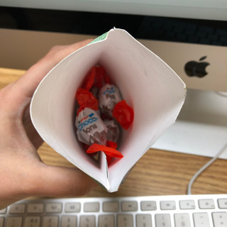
I then decided to create the items to go inside, the first being a small pouch which I planned on filling with boiled sweets. I did this with the thought in mind that people visiting us at New Designers might want a snack for their journey home, so I thought this could be a nice addition. I also wanted to wrap the sweets in personalised tissue paper just to make them more personal t
o my practice. Here is the finished pouch, I had the idea for the tissue paper a bit late for me to order any, but it is something I am planning on for New Designers.
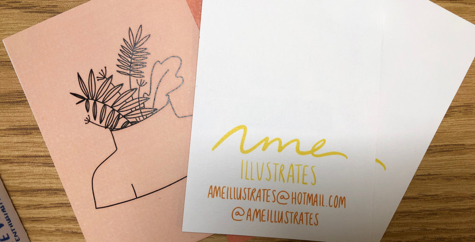
As as well as these, I produced other items using my existing artwork, such as postcards and a zine acting as a mini portfolio. I wanted to include these so that potential clients could see my illustrations if they didn’t get a chance to look at my portfolio properly. I also added my logo and contact information to the back of my postcards just Incase they were to get distributed to other contacts as postcards generally would.
I also designed a bookmark to include within this promotional pack, as I thought it may be something that people would keep and use in their day-to-day life and therefore it would be a good way for me to keep my name in their heads. I also included items such as one of my zines, a badge and a selection of stickers.
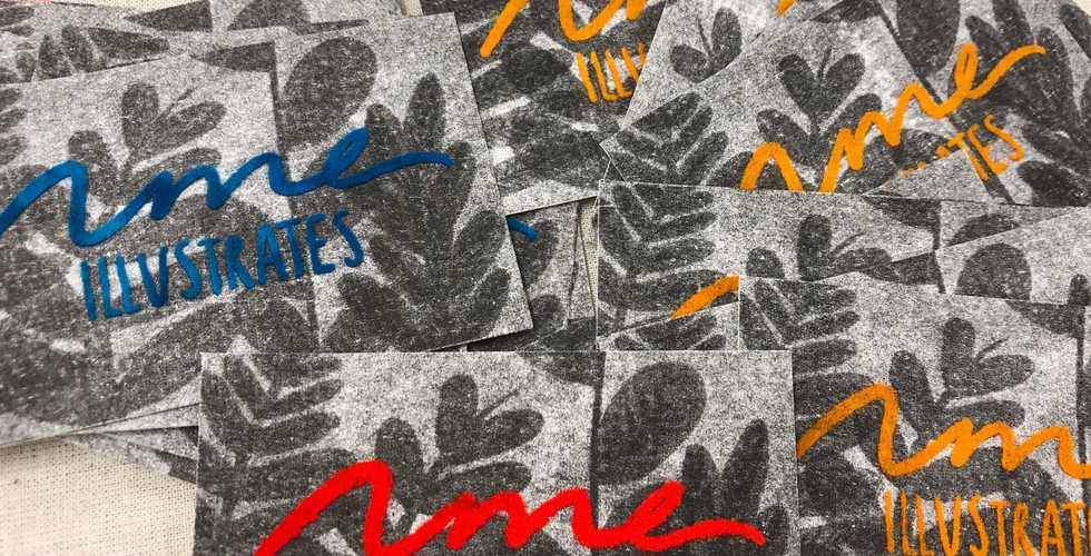
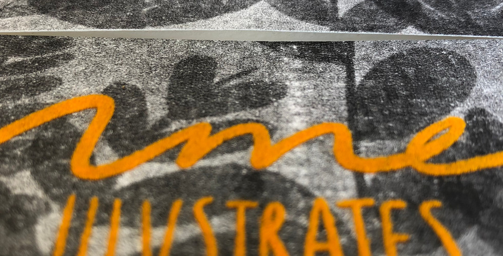
The item I am most proud of within this project is my business card. I designed and created them myself, using a variation of techniques including risoprinting and flocking. I also dyed my own flock so that I could have a selection of coloured business cards. I firstly risoprinted the base design and the back of the card, which had all my contact information on it. I did this because I wanted a grainy texture to juxtapose with the bright flock I was about to put on top, and as texture is a large part of my style, I felt it was important to include this in my business card and branding. I then burnt my logo onto a screen and passed the flocking glue through it, meaning it was now on top of the risoprint. I then used my dyed flock and the heat press to get a nice fluffy effect that complimented the risoprinted background well.
I am extremely happy with how these turned out and I only wish I would’ve made more, however there is still time for that. I made around 8p cards so that there would be enough for the graduation show and also new designers. These will go inside my milk cartons and I will also have some available to give out to people who are interested.
As well as all of these, I have put a portfolio together with a selection of my best and favourite work. I have a few adjustments and additions I would like to do before New Designers, such as order my tissue paper, print my zine in better quality and put a showreel together of all my animations. I do however feel happy with the items I’ve produced and I’m looking forward to seeing how they are received by the graduate show audience as well as the people at new designers.















Comments