ILL6 - Batsford Prize (part 2)
- Jan 10, 2019
- 3 min read
Following on from my first attempt at this project, I decided that I needed to do something that connected more to the title of 'Being Human.' I also wanted to potentially use this opportunity to work on my character design, as this is something I can be generally uncomfortable with. This may seem like a risky time to attempt something I'm not confident at, but I have been putting it off for a while and also had an idea for an potential illustration which linked to the them, but it involved characters.
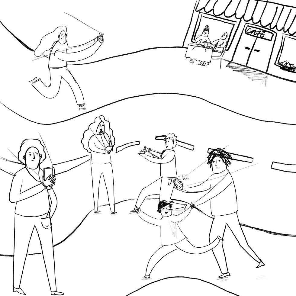
My idea stemmed from the fact that nowadays a lot of people depend on their mobile phones. I noticed when walking home from work that the majority of people I saw around town were either talking on their phones or scrolling. Even if it's just to check the time, most people depend on their phones. I then researched this and found that the average person spends around 2-4 hours on their phone each day. This led me to the idea of sketching some sort of crowd scene, where each person is ignoring everything occurring around them because they are distracted by their phones.
Here is the original thumbnail I produced:

This was just a very quick sketch with some very egg-like characters. I knew I wanted to add at least one more character around the top of the canvas as it was slightly empty. With this I then went on to add colour and make it A LOT neater. I began by illustrating the background, which is when I started to develop this illustration the most.
It began quite flat and quickly I realised it was beginning to look quite boring and not at all how I imagined it. I think part of the problem was also that I had made it a lot bigger, which brought a lot of unnecessary space to the plate.

After some seeking some feedback from my tutor, I decided that the overall composition was just off in some way. It was looking very flat and bland, so I decided to take a step backwards and have a play with the perspective. I then began to illustrate my characters in a separate document so that I could easily test different positions when it came to dropping them on to the background. I tidied up my original sketches and added some colour. Here are the characters I illustrated:
I then finished illustrating the background, this time with a different perspective, and added colour. I then placed the characters and after having a mess around with the placement of them, finally decided upon a composition I was happy with.

Following this, I decided to add some more texture. To do this I used some textures I had made personally attached them to the layers using clipping masks. I did this because I didn't think the composition was particularly exciting and I wanted to try and make it more eye-catching.
I used a variation of textures, including ones I made using paint, oil pastels and even pictures of the exposed concrete walls around university. I also used materials I found around the studio.

This was my final piece. Overall I'm still unsure on it. I think I improved it when I added the change of perspective, however it could be improved a lot. To do this I would probably re-draw the cafe in the background, and also practice drawing characters more as some of them don't look right. I feel like when I added the texture it became quite dark, which I originally thought I wanted, but after viewing it later I'm not so sure on it. I'm not overly happy with this illustration, but maybe I will go on to perfect it in the future.


Comments